When the #Brexit was announced, there was a bunch of hand-waving, and talk about how the global market was dropping, I wondered:
What exactly is happening when “the market drops”?
Because of my years working for an investment advisor, I knew to check out stock market indexes, and I started with the Dow Jones Industrial Average (DJIA), and the S&P 500. The DJIA dropped 600 points the day #Brexit was announced, and 900 points total in the 2 days after. But wait, I thought, what does that even mean?!
So, I share with you explanations of two Stock Market Indexes – the barometors of market activity, the rise of 1%-level wealth, and even a little finance conspiracy drama.
The stock market represents a global agreement that companies and resources have value, and stocks themselves are sold for dollar values. But indexes — combined lists of stocks — are represented by “points.”
The DJIA is, currently, in the thousands of points. Those points represent dollar values. But it’s not $1=1 point. The DJIA takes the value of stock from 30 different companies, and adds up the value, then weights them (that is, uses a value less than one to account for splits and dividends in the companies) using a formula meant to reflect, in theory, market pressures. Companies like Boeing, Coke, DuPont, IBM, Visa, AmEx, Disney, Apple, etc all grace the DJIA list.
The DJIA was created in 1885 by Wall Street Journal editor Charles Dow and a statistician Edward Jones. Back then, it was at 62.76. This is where the “industrial” part comes it — it was the beginning of industrial production and, thus, big businesses.
The total value was held at 71.42 points during WWI.
By 1972 it reached a value of 1000 points for the first time.
In 1995, reached 5000. Feb 1997 brought 7000, July 1997 8000.
March 1999: 10,000 points.
Why were people frankin out about globalization in the 90s? The rate of global wealth generation had a metric to track it. Anyone you know in the 90’s and 2000’s who was getting frantic about globalization had a good reason: Global capitalism invented and created wealth that, from 1972 to 1999 increased 10x.
That’s like buying a car for $1,000 and finding out it’s worth $10k later. But, remember – each of these represents ONE share of stock. Usually, people buy more than one. Welp, that’s where the 1% come from. Moving on…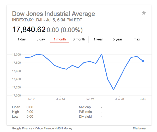
Most of you all reading this will recall the recession of 2008 – the DJIA reflected this by ending 2007 at 14,000 – and dropping to a 12-year-low of 6547 in March 2009. By May 2013 the index was over 15,000 (remember 1999?) and, as I write it’s at 17,840.
The S&P (Standard and Poor’s) index does something similar, but with 500 large-cap (that means giant corporations/big businesses’) stocks. Today, it’s at 2087. For comparison, in the depths of the recent Recession, on Jan 1, 2009 it was at 865.58.
The S&P 500 “…is one of the most commonly followed equity indices, and many consider it one of the best representations of the U.S. stock market, and a bellwether for the U.S. economy.[8]” says our friend Wikipedia. Correct – this particular index indicates across market sectors (kinds of investments) what the market as a whole is doing.
Finally – fascinatingly – the company that owns the S&P *also owns* the Dow Jones, via fancy mergers Wall-STreet Style. The DJIA is “Currently owned by S&P Dow Jones Indices, which is majority owned by S&P Global.” This means that one company is tasked with sharing the metric for the US market to a global audience: if it were me, I’d want to make sure the picture never got too ugly.
What’s the point? A lot of writing on these indicies focuses on the values of the index itself – what the number is. Why? These collections of stocks tell a story about how market capitalism is doing.
So, if the value is dropping, “the market” overall is losing value, reducing the amount of capital a-flowing — and, often, money in your retirement account.
When indicies drop, it’s a sign that stocks/mutual funds/bonds etc. that you may own may be worth less money. There is truth in the fine print you sign when you invest – there is no guaranteed return on your invested money.
But, over time, the return on any investment seems to average out ok. Considering the 10x increase in global wealth over 50 years that makes sense, even if capitalism itself doesn’t.
Below is a chart showing only 2008 – 2015 annual average returns (eg the money made on investments in stocks), using the S&P 500 Index. Note that the High/Low bars are averaging from 1970-2015. See 2008? Terrible year to try to make money. 2009? Pretty good:
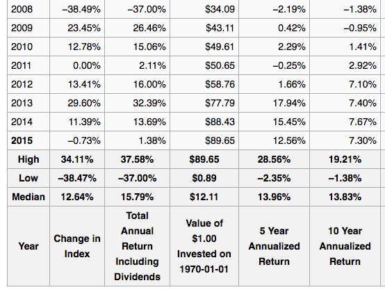
It’s quite all over the place – which leads to my final point.
If you look at any one day – or any one year – in the market, the tiny fractures and potholes in The Market are very clear. If you pull back, things smooth out. It’s like when Bette Midler sings “God is watching us…From a Distance.” When you get away from the details the overall picture emerges. For most of us who invest in retirement account-type stock funds, it’s the 10-year and up picture we need to look at.
My 0.02? Perhaps, yet, capitalism will completely fall and The Market(s) will tumble permanently down. It does seem a bit precarious. Until then, I’d like to stop working someday, and be able to eat when I do, and so I put money away for retirement in mutual funds comprised of stocks and bonds.